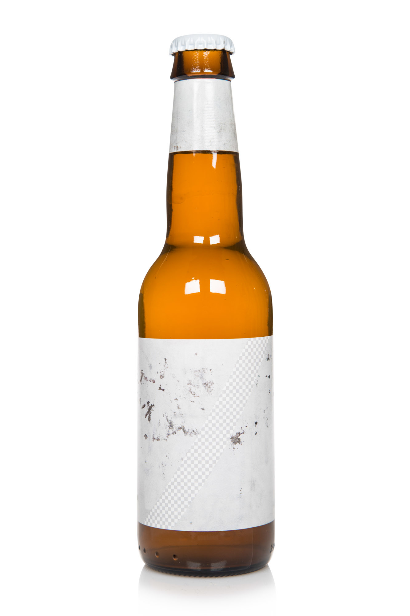
The label consists of a photo of some graffiti that has been covered in a slightly different hue than the original colour of the wall. The attempt to remove the graffiti creates a new visual expression which is subtle but distinct. Running over this is a diagonal line masking a transparency pattern — something that is familiar to users of applications like Photoshop, where it's used to illustrate emptiness.
The overall look of the label is really downplayed and almost dull with it’s subtle fluctuations of grey.
I think it’s important to be really careful naming a piece of art or design as being critical. The realm of capitalism is really hard to truly criticise from the inside, and I’m not saying that this is by any means being anti-marketing or anti-consumerist. It’s a commercial product after all, which is produced by a company earning a profit. But I do think that the label is a reaction against the shiny and colourful graphics of most consumer goods. In a culture defined by a constant flow of loud images, this is barely whispering.
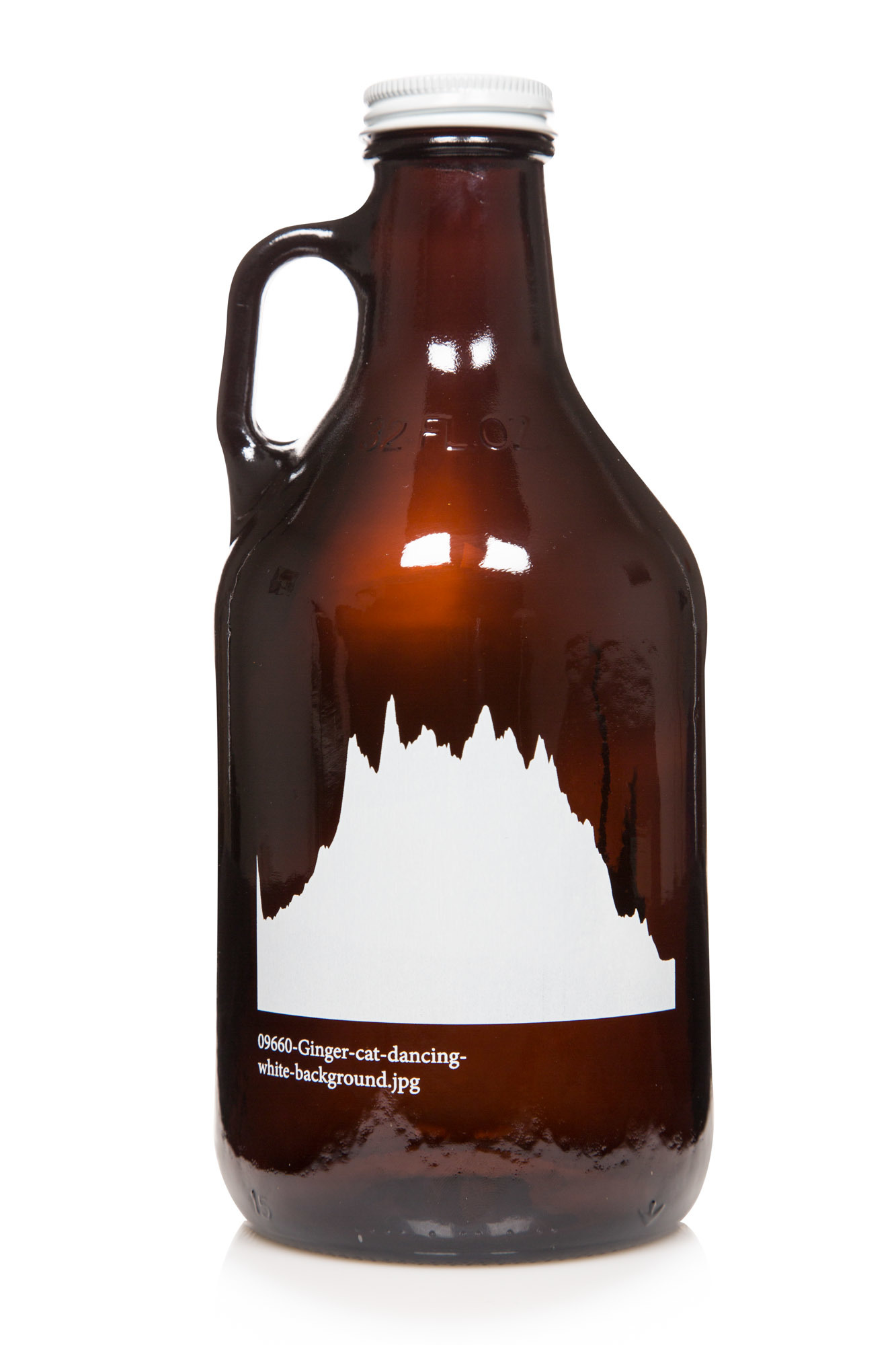
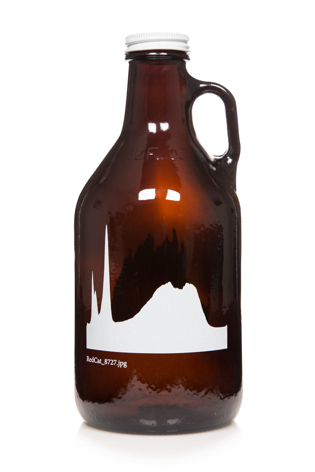
The silk screen printed graphics on this growler consist of histograms based on random photos of cats found on the internet. A histogram is a graph showing the distribution of light and dark in an image. It's usually used to determine if a photograph is properly lit. The distribution of light and dark differs from each photo and produces histograms that are unique, like a fingerprint.
I like that seemingly simple pictures found online are being turned into abstract forms that almost resemble a mountain range or stock market graphs. It's of course also an homage to the culture of cat-related images and videos.
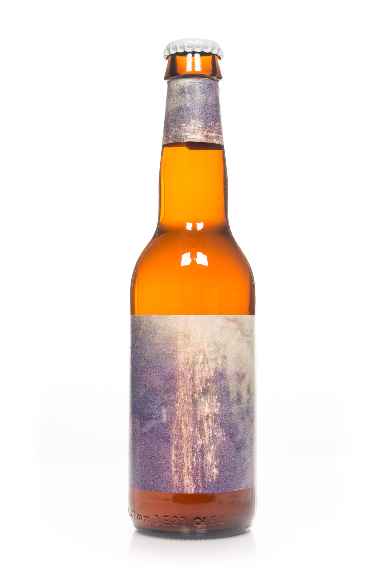

The design consists of a photo shot from an airplane over the Po Valley in northern Italy at night. The light sensitivity of the camera has been set to maximum, which produces an extremely grainy photograph. Sur Motueka is a part of the ‘Sur Series’, which deals with various kinds of sour beers. Several of them feature very grainy images, and I feel that this instalment is one of the most accomplished in the series.
The white parts are caused by ice forming on the airplane window. The ice forms an interesting composition contrasting the lights of the city below. The image has been turned 90 degrees, and it sits somewhere between abstraction and figuration.
It both deals with the melancholic feeling of being on an airplane at night, and is also about the texture and grains caused by the low light. Usually photographers try to avoid these kind of artefacts, especially ones caused by digital cameras (like the one used to make this image).
I find these grains and glitches quite beautiful. They seem to almost give the image tactile properties and reminds us that what we’re looking at is just a printed representation, not the actual truth.
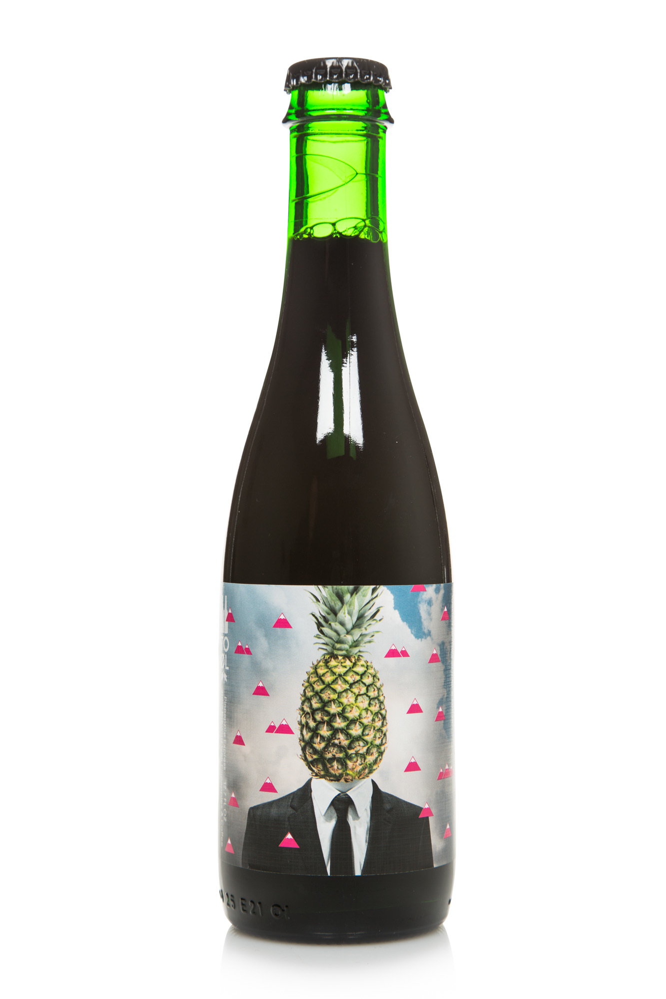
There is just no direction here. A man in a tuxedo with a pineapple head. A cloudy sky and some magenta mountain pictograms. There were pills on the first draft, but these had to be censored due to American legislation. They were replaced with mountains just like D12 turned ‘Purple Pills’ into ‘Purple Hills’ to please MTV. There is nothing wrong with having no direction — it can actually be a good design strategy. The problem here is that is hasn't been taken far enough and ends up falling between two chairs as a boring and mediocre design.
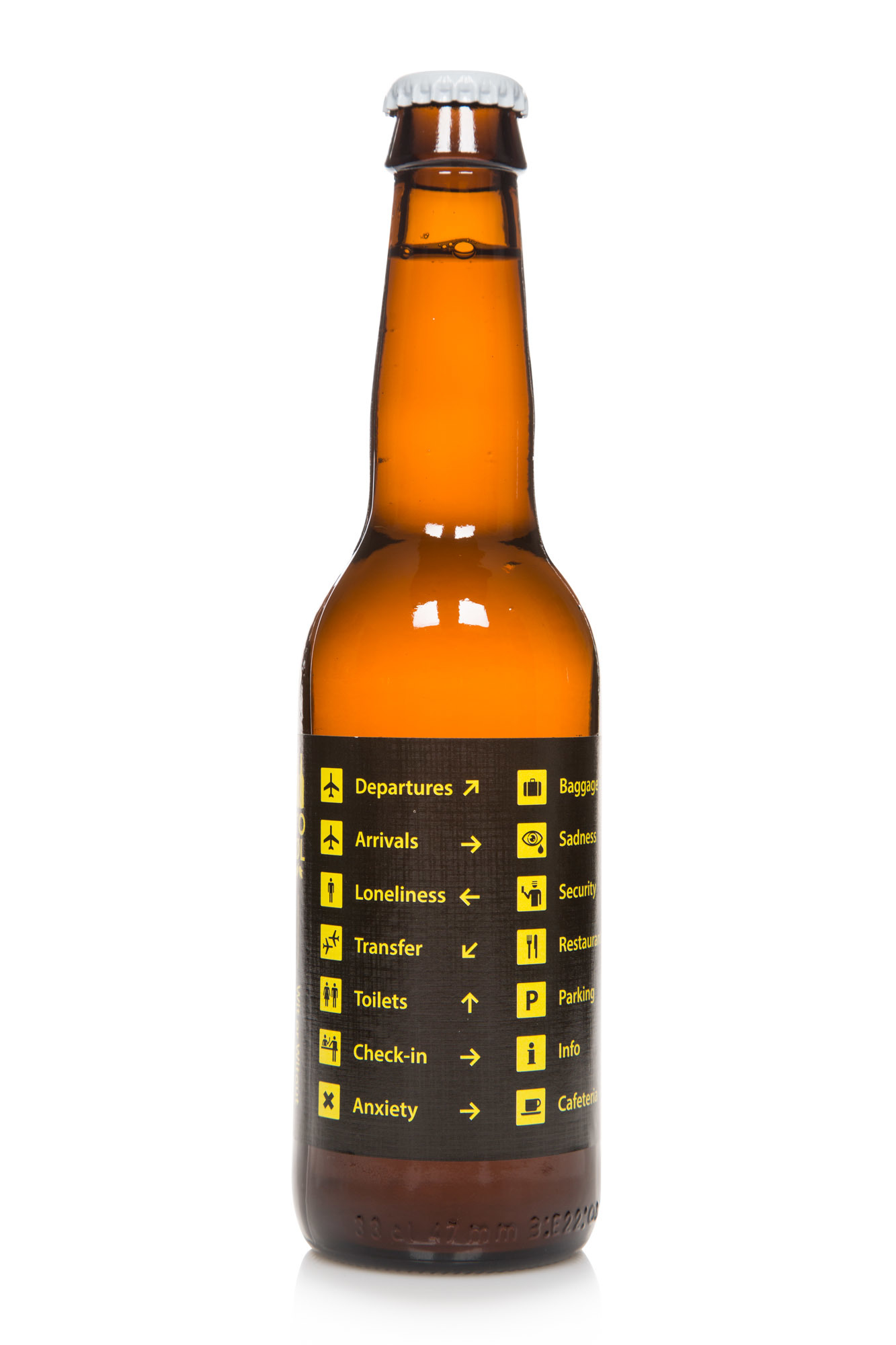
This is just pathetic. If some teenage emo band should design a beer label this is what it would look like. Pictograms from airports are mixed with fictional pictograms showing various emotions. The basic idea of conveying some of the hidden feelings in airports is interesting. The problem here is that it's done in such a blatant way that you just end up feeling nothing.
This is by far the worst design I have made for To Øl. The ones mentioned above at least have some charm to their failure. This is just bad.
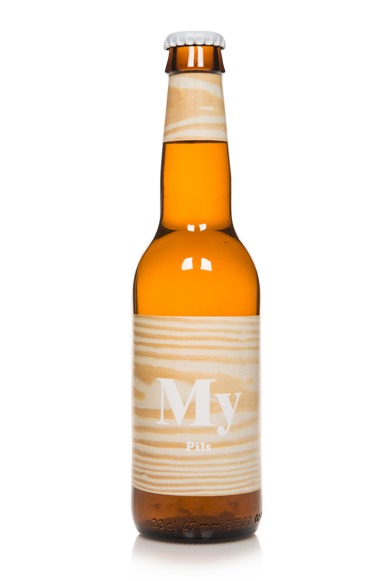
The first version of this beer was called ‘Maj Pils’ and was made for a group of carpenters and craftsmen called Maj Byg to celebrate their 30th anniversary. It featured an image of some wood and nothing else. A design I was quite pleased with. Then To Øl got that beer accepted into the Systembolaget and the name was changed to My Pils.
The Swedes also required us to have the name on the front. This could be solved in an interesting way by rethinking the entire design, but I didn't. Instead I chose just to write the name over the original design. The combination of the cosy and welcoming type treatment and the Web 2.0 style name with the wooden background ends up as a total disaster. To makes matters worse this is the most produced beer in To Øl history with over a million bottles.