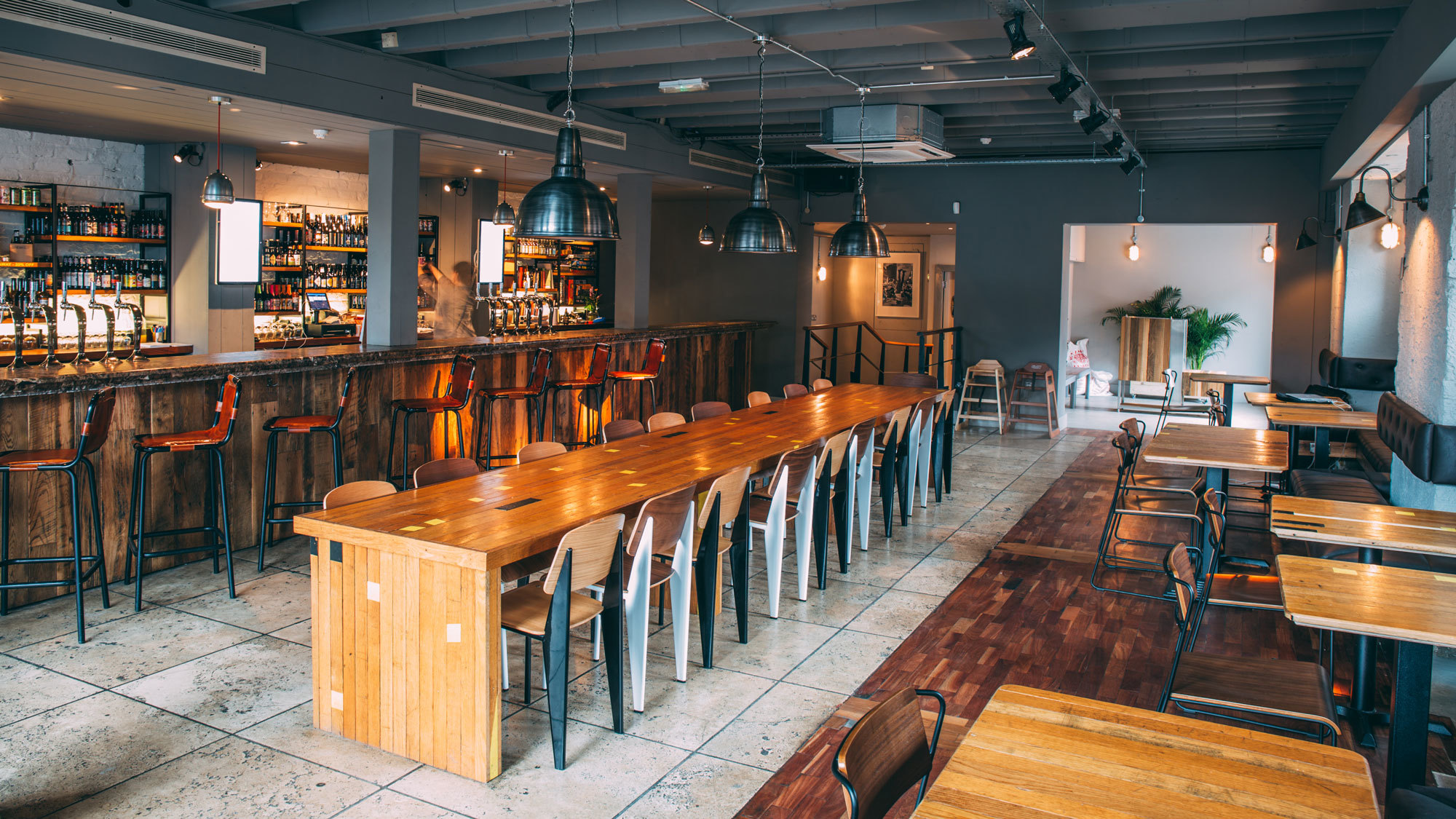
Logan Plant, Beavertown’s founder, and Nick Dwyer, the company’s Creative Director, both admit to feeling a little rough when I arrive at the brewery on a Monday that follows a particularly heavy weekend; one in which Beavertown celebrated its fifth birthday by hosting an event that showcased five other breweries and the five beers each brewed in collaboration with their hosts. There was clearly a lot to celebrate: this iconic London brewery has come a long way since its humble beginnings in the kitchen of Duke’s Brew & Que — the pub that serves as Beavertown’s spiritual home — and now processes around 30,000 hectolitres a year.

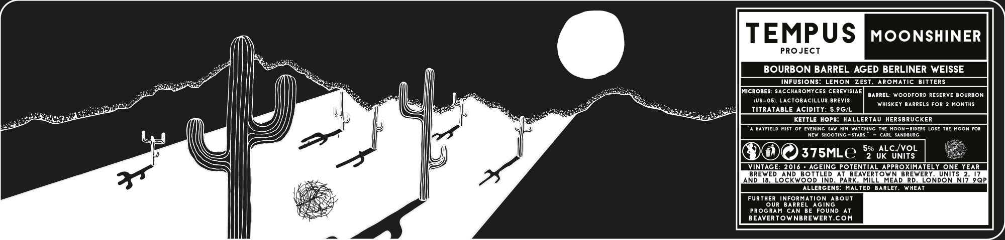
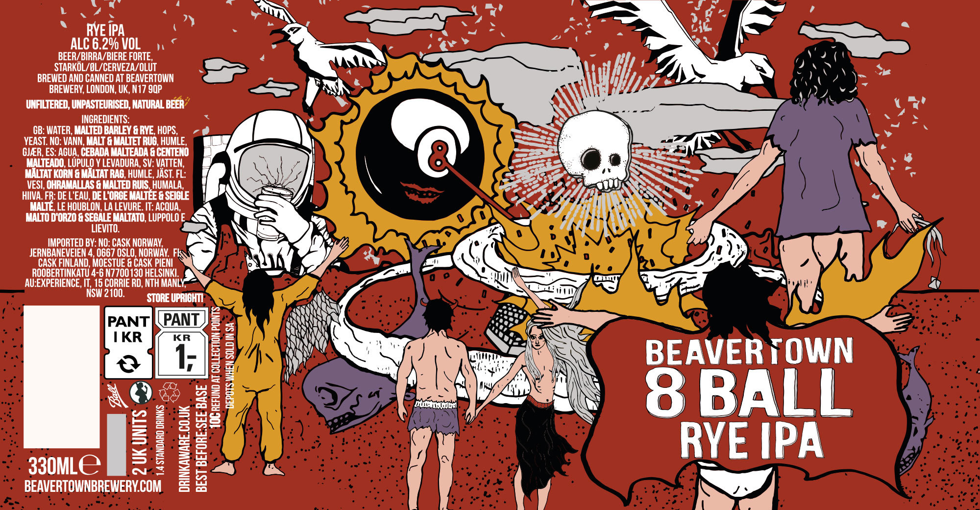
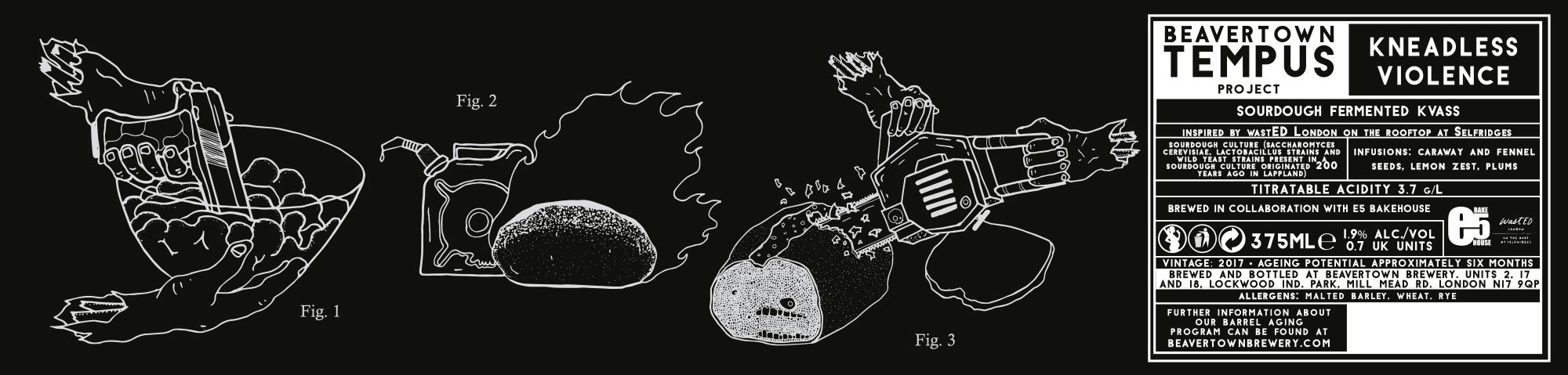
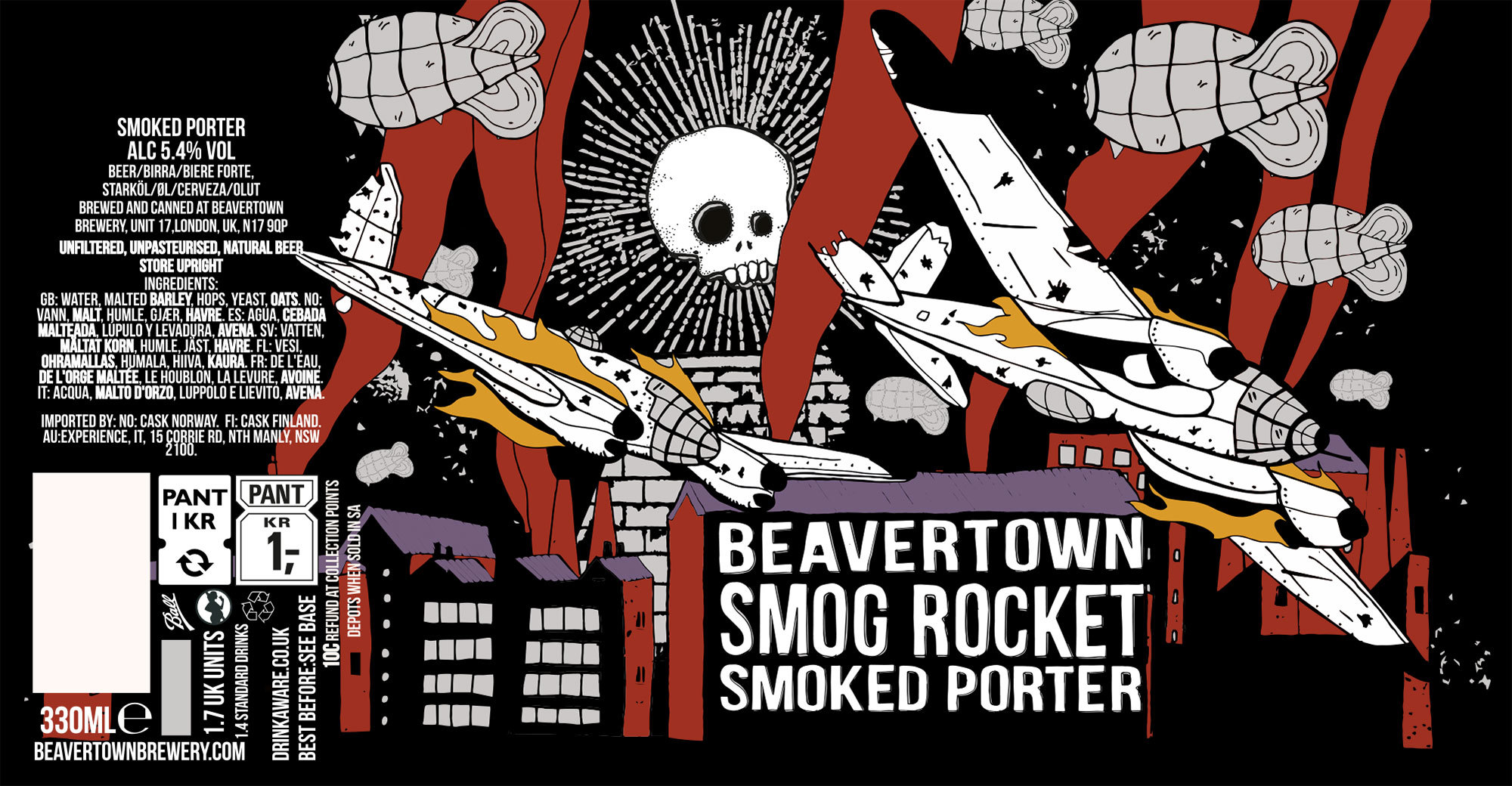
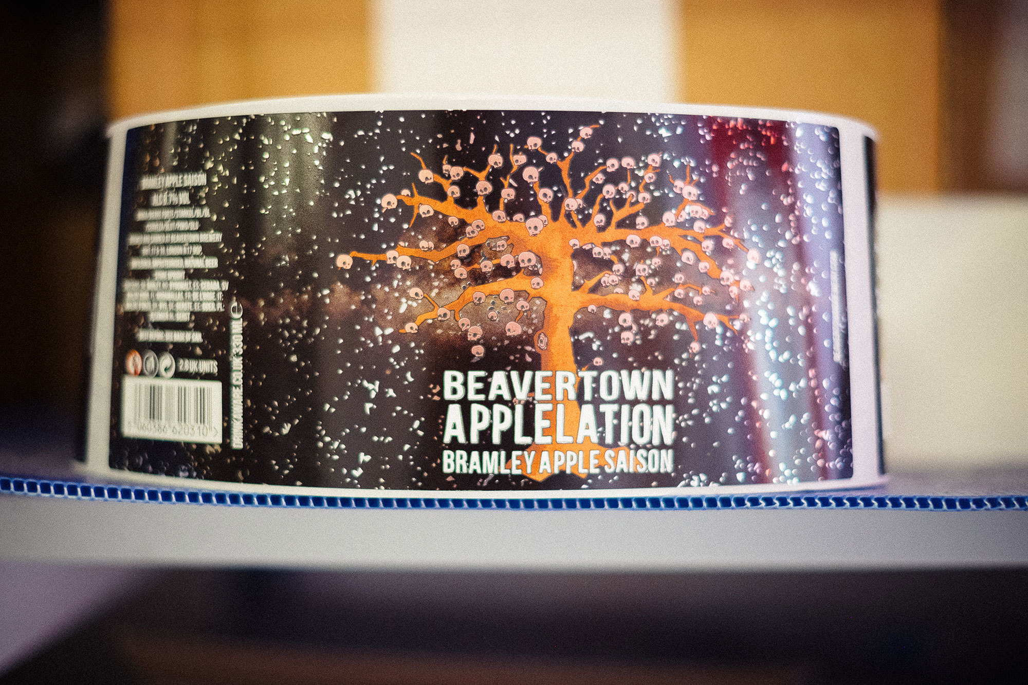
Can artwork for Beavertown’s core range, along with (thinner) labels for the barrel-aged range of bottles.
For Logan, an interest in beer began long before the craft beer movement, having spent a considerable amount of time in pubs as a child. “Growing up as a young boy in the West Midlands, I was surrounded by beer — and mildly alcoholic parents!” he laughs. “The great thing about that area, and the thing that we drive into what we do at Beavertown, is that the beer is central to everything, but the things that go on around it are special: amazing pubs, amazing people, amazing environments. So there’s always been that whole romanticism to beer for me, and I had a dream that one day I’d be able to create my own.”

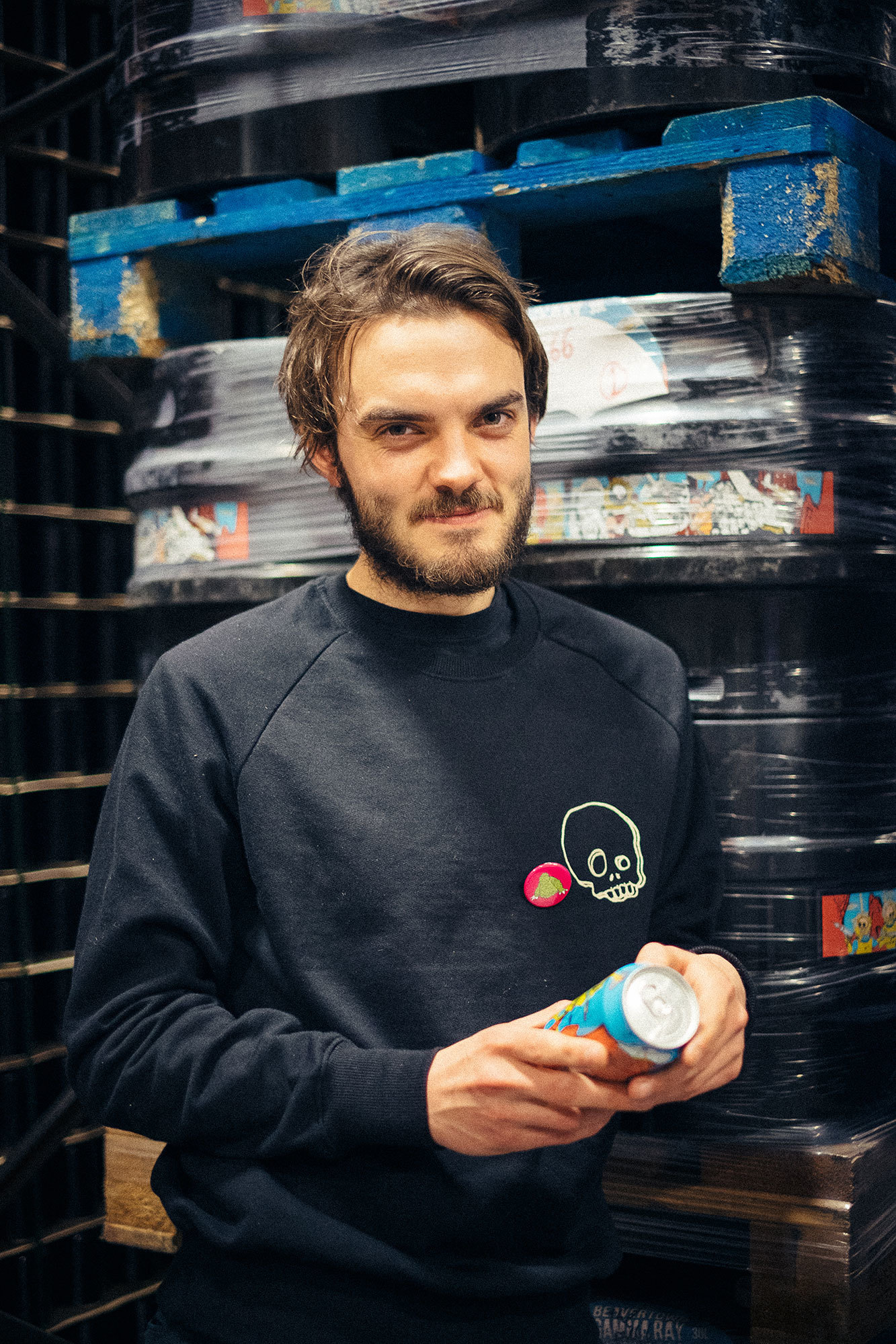
Beavertown founder Logan Plant (left) and Creative Director Nick Dwyer (right).
This interest continued into Logan’s early 20s and, as his palate started to develop, he admits to becoming “obsessed with a load of the breweries up there”. By the time he was 30 and had enjoyed degrees of success playing in world-touring bands, Logan had a young family and began to feel the strains of being away on tour. On one of the final tours, he had his interest in beer reignited at Fette Sau in Brooklyn, and decided to call it a day and go back to his original dream: he opened Duke’s in February 2012.
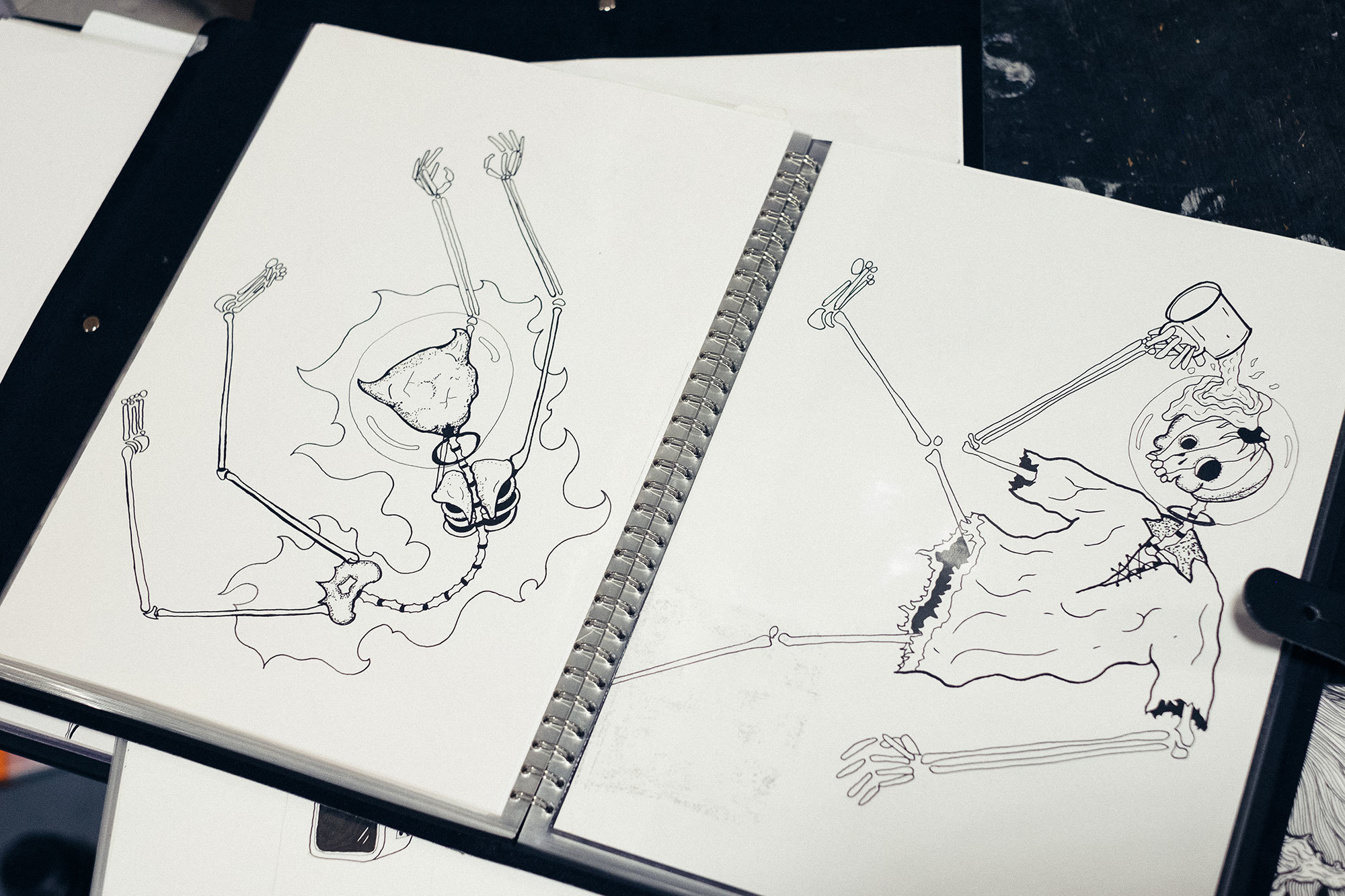
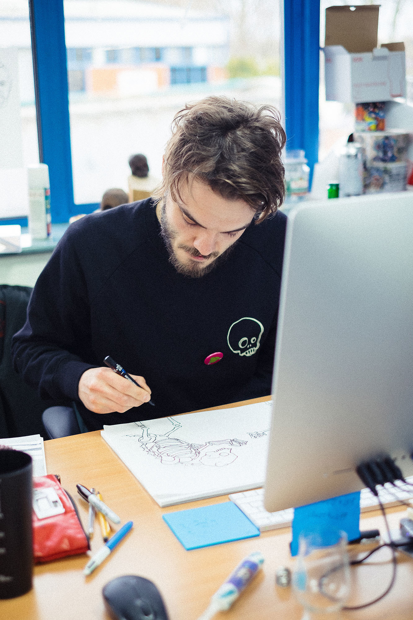
Nick’s linocut for Black Betty — the artwork that kickstarted his involvement with the brewery.

With no official brewing assistants in the pub kitchen, Logan took in anyone who was passionate enough to want to help out, and one of those people was a man named James Rylance, a close friend of Nick’s. It wasn’t long before Nick himself got a job working as a waiter at Duke’s, and began intentionally leaving his sketchbooks open whenever Logan came in to brew.
This persistence paid off: during a period in which the newly formed Beavertown Brewery (so-called because of the Cockney name for the pub’s neighbourhood, De Beauvoir Town) commissioned different artists to illustrate labels for each new beer that Logan released, Nick was asked to contribute a label for the first iteration of their Black Betty black IPA. “I came in, talked about the beer, and did a linocut for the art. All of a sudden, I had a way of having my work distributed via the medium of people drinking it.”
“Fate, and what it brings you, is an amazing thing. Everything we’ve done in the last five years has been about being in the right place at the right time, and finding kindred spirits.”
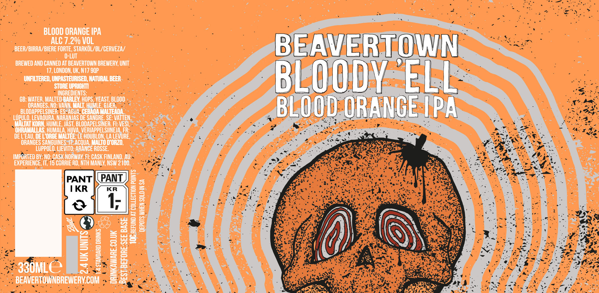
Although the rotating artists idea continued for a while, Logan and Nick became close friends, and Nick continued to help out where possible, building the company a bare-bones website and designing a new label for Gamma Ray, the brewery’s flagship American-style pale ale. But it was during the creation of the first label for Bloody ’Ell, Beavertown’s blood orange IPA — “which is when I felt I could really make a mark” — that Nick’s services became indispensable. He was offered a job in-house, initially for three days a week, but after one week it became obvious that he was needed full time. Logan reflects on this period: “Fate, and what it brings you, is an amazing thing. Everything we’ve done in the last five years has been about being in the right place at the right time, and finding kindred spirits.”

Employing an in-house illustrator or designer is far from the norm among breweries, although there are certainly other breweries that have taken a similar stance, such as Mikkeller, Magic Rock, and To Øl (who wrote our guide to Copenhagen’s craft beer scene in issue 2) employing Keith Shore, Richard Norgate, and Kasper Ledet, respectively. “It’s the best job in the world,” Nick says. “It’s so easy to get inspiration for each new beer’s artwork. I’ll take our core concepts — a sort of Mars Attacks meets Dan Dare sort of thing — and then I’ll go and talk to the guys actually brewing the beer and ask them to explain it to me.”
Clearly being physically present on the same premises as the brewery is hugely useful, but it’s Logan’s hands-on involvement in the creative process that plays such a huge role in Nick’s art. Nick describes one particularly memorable brief, for the Power of The Voodoo triple IPA, which came in the form of an email. “Logan had been drinking with the guys from Boneyard in Bend, Portland, and sent me an email that had the language of an ex texting in the night. ‘I miss you! I’ve been thinking about the label and how I like Labyrinth and how we should work in the power of voodoo.’ Then there was a line break. ‘And a death star.’ And then the email ended!”
When I cracked [the can] open, it smelled so good. I’d never smelled any of our beers — or anyone else’s beers — like that, and it turned my head.
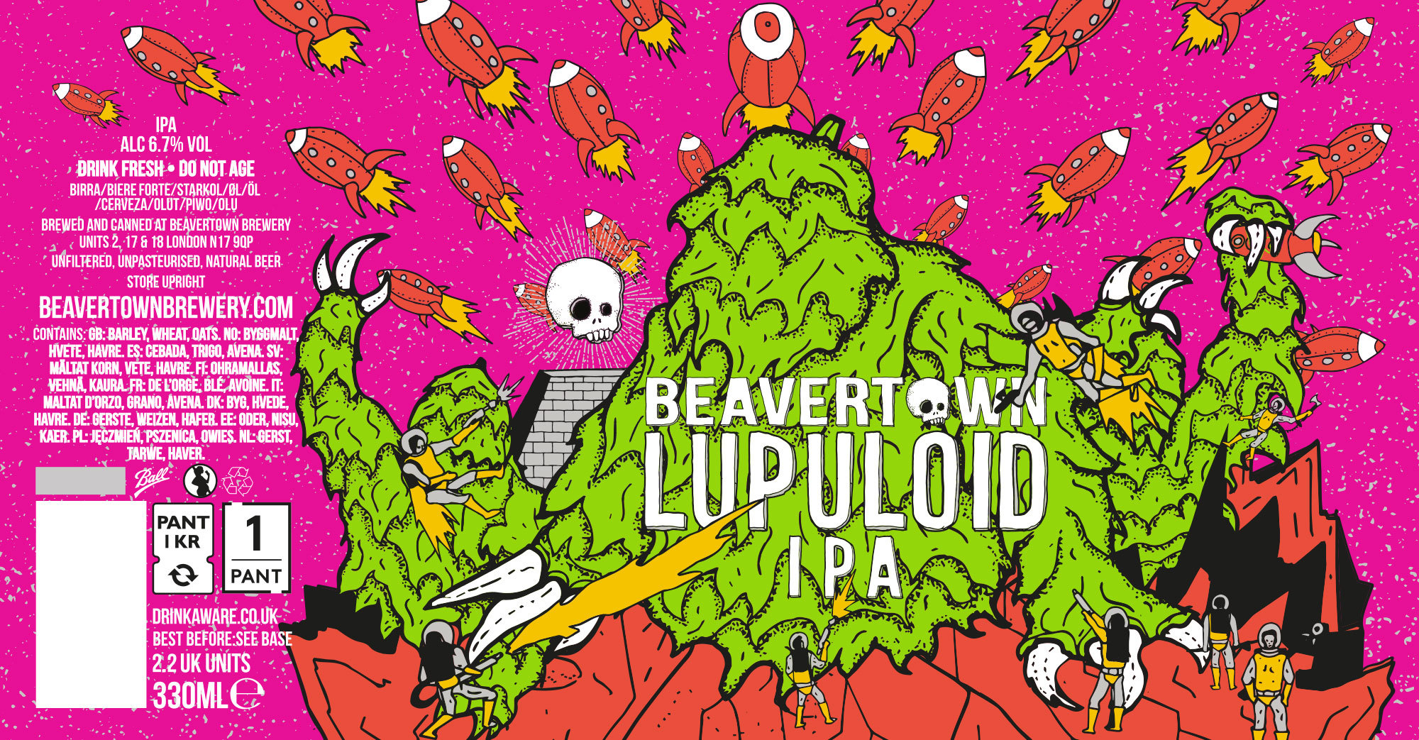
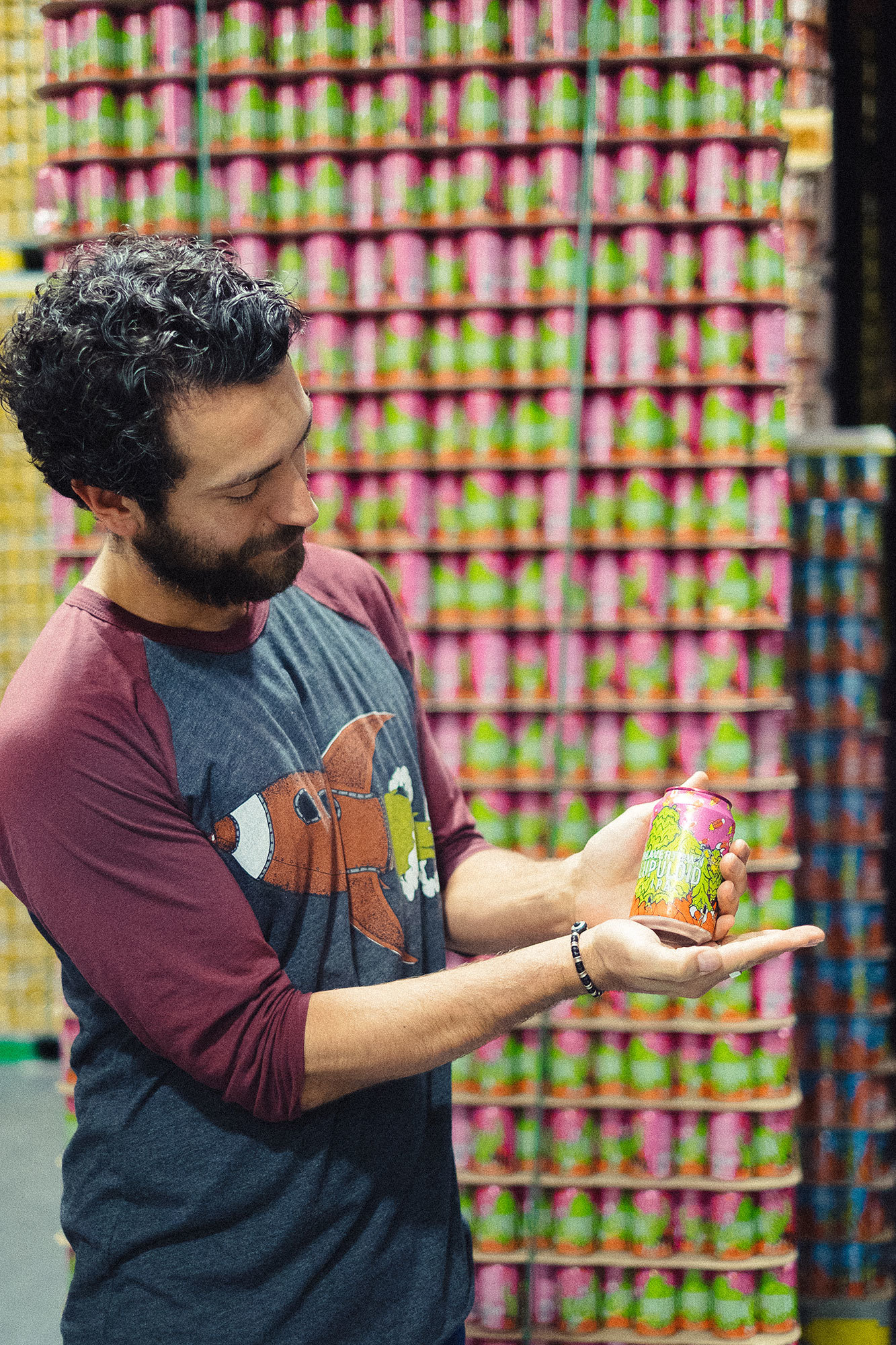
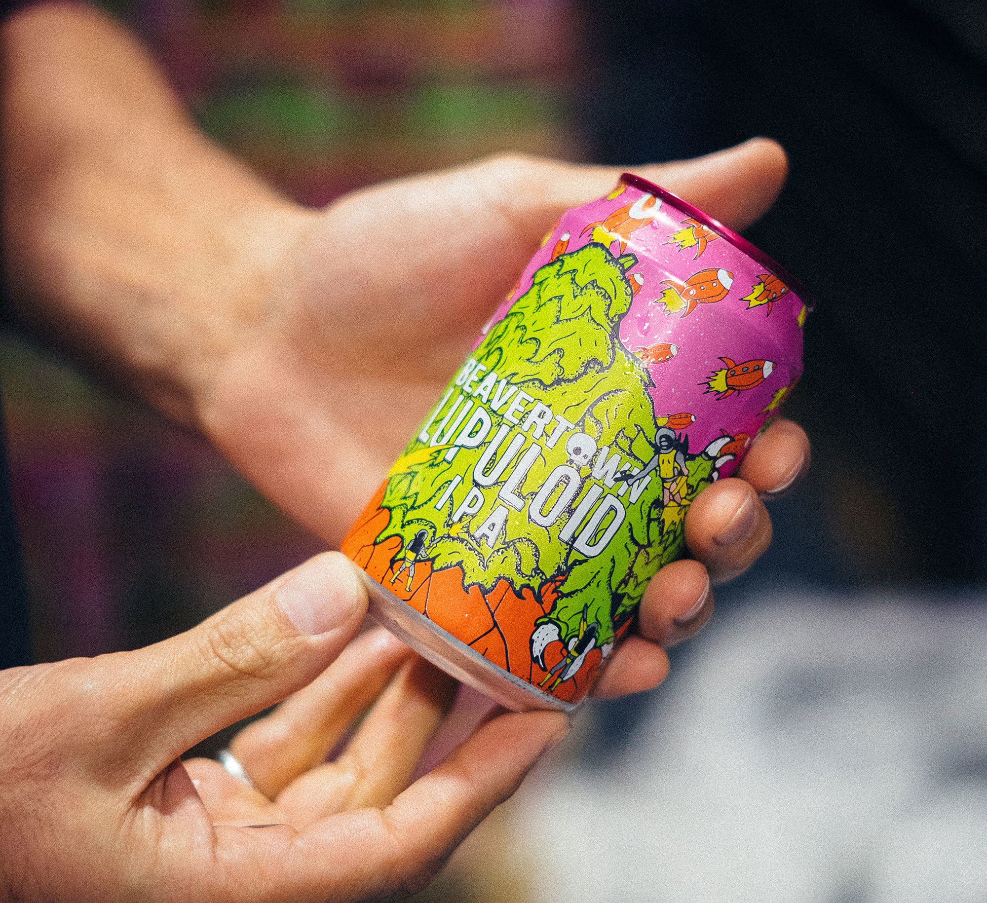
As we talk, we each sip a Lupuloid, an extremely hoppy IPA and the latest edition to Beavertown’s core range, from the staff fridge. It’s about as fresh as you can get off the production line, and we start to delve into the can format itself. Logan recalls a family trip to the US in 2012, not long after starting the brewery, where he had his first experience of craft beer in a can. “When I cracked it open, it smelled so good. I’d never smelled any of our beers — or anyone else’s beers — like that, and it turned my head. Then I looked into what cans do for beer and they’re just the perfect carrying unit for the type of beers we make. At the same time, we were kegging our beers and they were tasting way better than what was coming out of our bottles — and for the same reason as cans: no light, no oxygen.”
So just 18 months after Beavertown’s inception, the decision to move to cans was made. “One day Logan came in with a can of coke, with one of our bottle labels wrapped around it,” Nick remembers. “We both agreed that the existing labels weren’t really working. Logan said: ‘We’ve got to rebrand and I think you should do it.’ ” And thus the wheels were set in motion for Nick’s entire re-imagining of the brewery’s visual language.
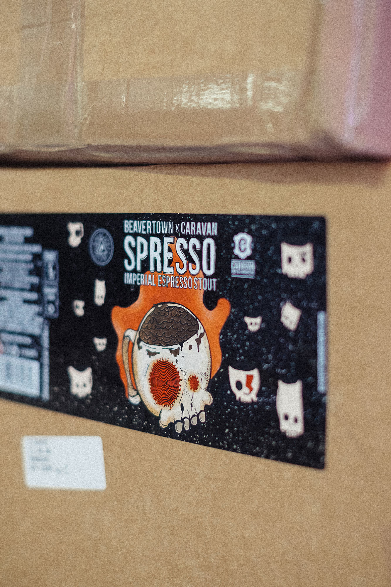
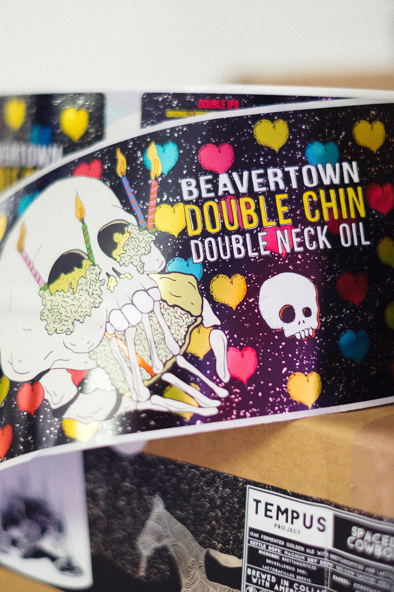
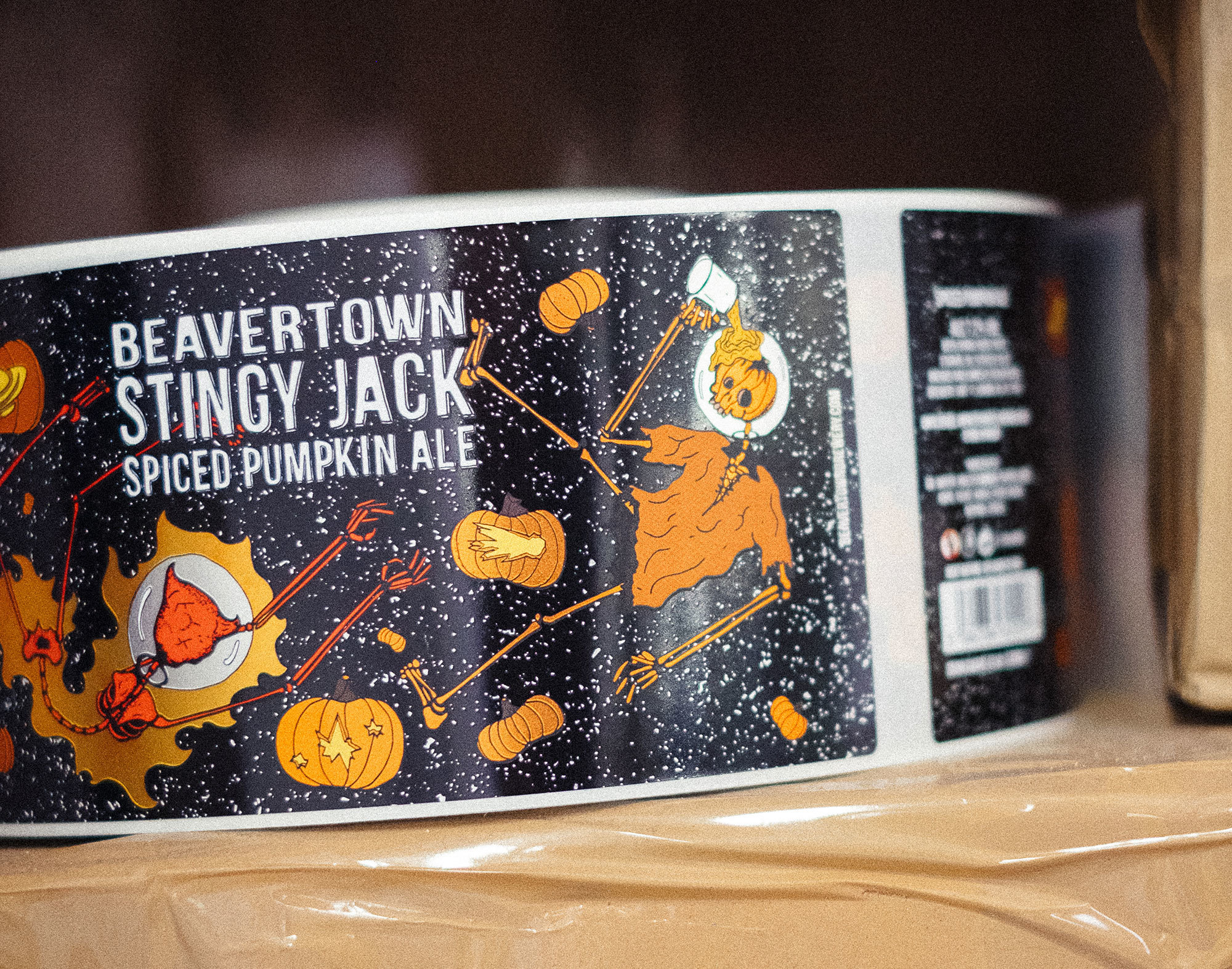
There are other subtle elements to be found in each of Nick’s illustrations, from the Ziggy Stardust tribute skull on Spresso (see above), created during the week David Bowie died, to the inclusion of members of staff (albeit in skull form) on the Neck Oil artwork. Until recently, that beer has depicted staff who got Beavertown to the point where the move was made to cans, but last month saw the release of a redesigned Neck Oil, and the new illustration represents more members of the growing Beavertown family.

Nick’s new Neck Oil artwork — set loose into the world shortly after our conversation.
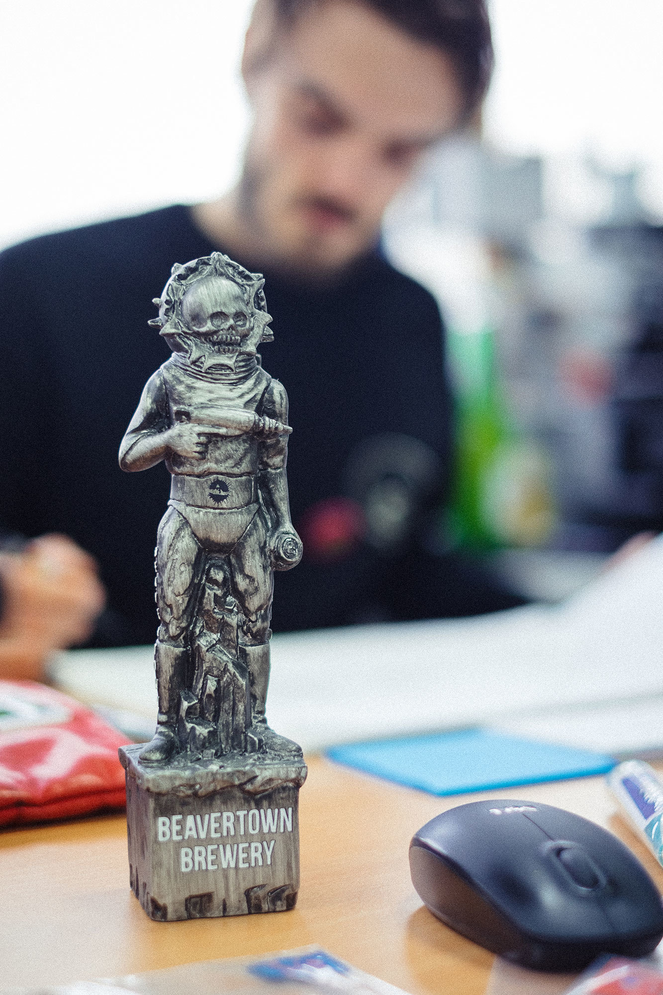
But, of course, it’s not just the art itself. Logan and Nick are deeply invested in the entire experience of the beer, and as such the cans’ treatments play a huge part, from their use of foiling to their rough matte finish. “The three things people say,” Logan explains, “is that it looks great, the beer tastes great, and it feels fucking cool, too!” The tactile, experiential nature of Beavertown goes beyond the cans, though: Nick enthuses about the care they put into sourcing the best quality material for the brewery’s merchandise and shows me a carved wooden skull he’s made for tap heads, as well the resin tap heads they’ve had made out of the skeleton characters.
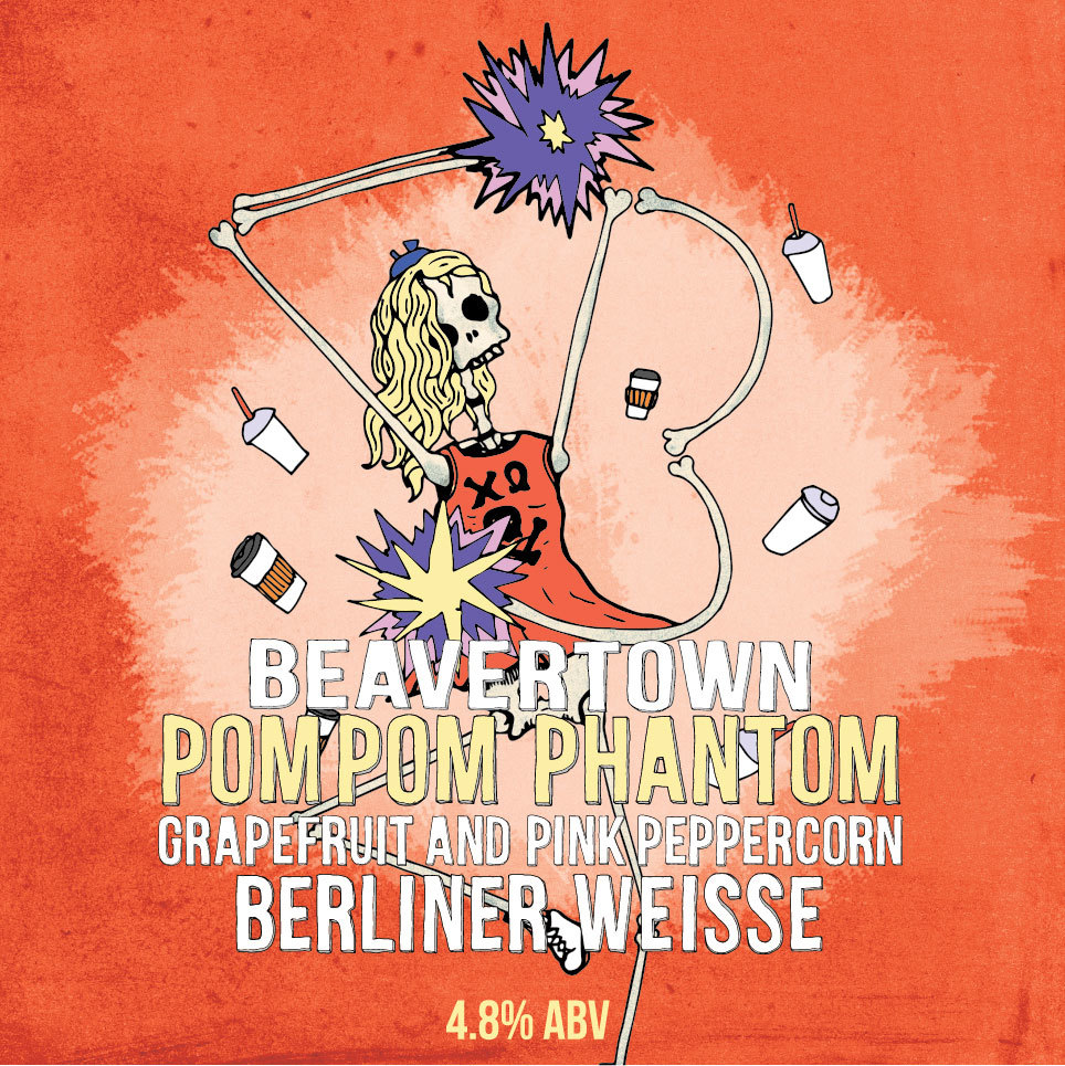

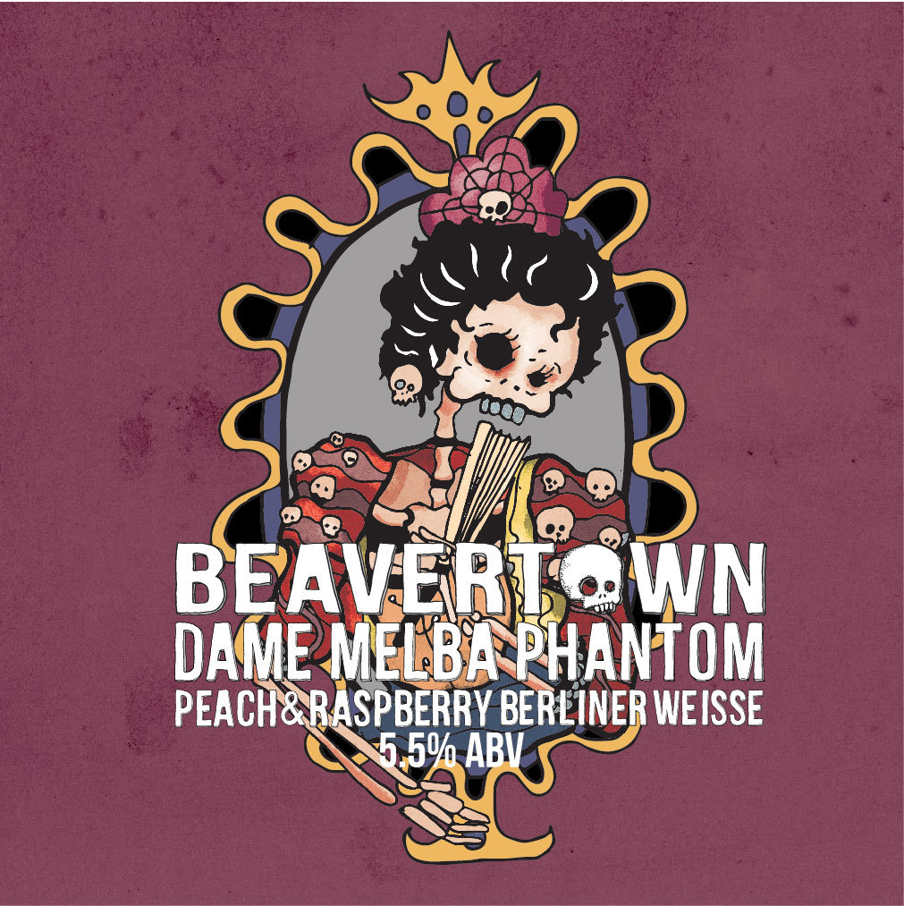
On the subject of the near-ubiquitous skeletons, Nick says that “people tend to ask about them either because they’re genuinely interested in them, or they’re sick of seeing them”. They have their roots in old drawings of robots with rib cages — one of which hangs on Logan’s office wall — but made their proper debut in Beavertown art with the release of Lemon Phantom, a lemon-infused Berliner Weisse that is somewhat Fanta-like — the hangover drink of choice for Beavertown staff.
“On a deeper level, though, they’re ageless, genderless, sexless, and raceless,” Nick says. “We’re being 100 per cent inclusive!” He’s joking, but I realise it’s actually true. Beavertown makes very special beer, presented beautifully, but the brewery remains firmly on the ground in spite of its huge success. This is beer for everyone, created by a brewery with an exceptionally strong artistic vision, but one that never takes itself too seriously.

Read the original version of this story in our sixth issue, which features a new look and is available to buy from our online store.
Buy Lagom #6